Overview of Content Strategy & Design Components
Phases for a site redesign for the San Diego Floral Association. I performed all planning and UX tasks and hand-coded the site from scratch using, HTML5, CSS3, jQuery, and JavaScript.
Content Assessment | Personas | User Testing | Info Architecture | Wireframes & Prototypes | Responsive Views
Content Assessment
We created a Content Matrix, a spreadsheet of existing pages, urls, topics for evaluation, and assessed each for quality, completeness, order, relevance and other attributes. Pages were organized into categories & subcategories. These were used to define potential audiences and primary objectives of the site. We also collected all the existing content into a library of individual documents for review and editing.
Personas
These hypothetical users were created to reflect the tastes, interests, and objectives of our primary target audience, based on the preliminary review of the content matrix, the existing site, and further research into the organization. Once we had a stronger understanding of our target group, we did a preliminary cleanup of the content structure.
The audience was determined to be generally low-tech, mostly retired, homeowners, some industry professionals, etc. Persona cards created with Extensio (Also created an identical version in Excel which could import data from survey spreadsheets and autofill in this clean visual format for multiple personas.)

User Testing
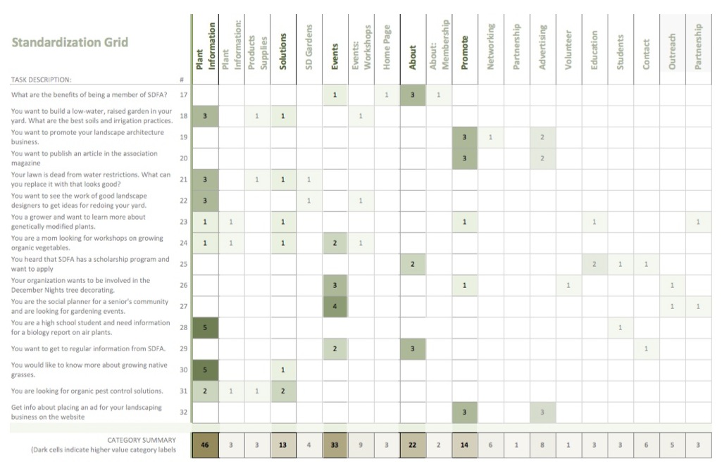
We designed card-sort exercises to define the most relevant tasks and objectives, and how these users thought about and performed those tasks. Tasks were then re-categorized, prioritized, tested for consistency with a reverse card sort, and adjusted based on a standardization grid which weighted tasks based on their value to users.
After performing a Card Sort with users to assess how they identified with and thought about terminology for a variety of tasks we assessed the data. I created this Standardization Grid in Excel using conditional formatting to identify key content groupings. Darker colors identify more relevant data. This helped define the primary areas of interest to focus the site on, resulting in a more concise and clear structure focused in three zones: Events, Solutions, and About the Organization.
Info Architecture
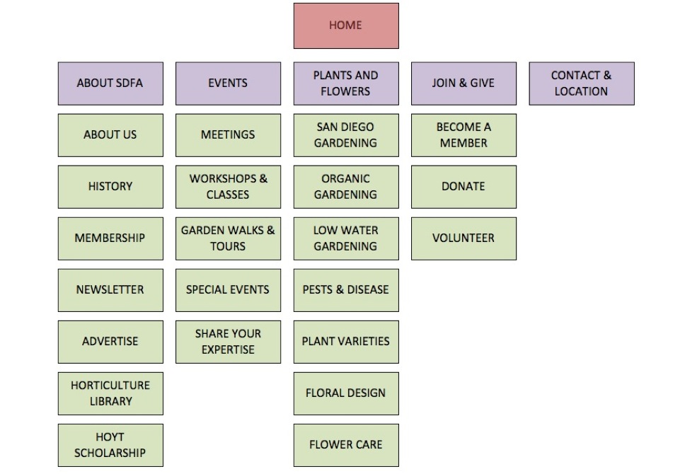
Initial Abstract Model of content used to define final information architecture, created in Excel.
Wireframes, Prototypes, Design
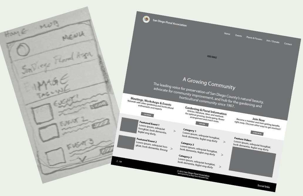
From there, the design phase begins with lower fidelity sketches and wireframes, to high-fidelity prototypes, ensuring that content and layout assists in reaching the primary objectives. Development of the site began in parallel with the final prototypes.
Prototypes, Low Fidelity
Manual sketch and low-fidelity prototype created with Axure
Prototypes, Mid Fidelity
Medium-fidelity prototypes for desktop and mobile created with Axure
Prototypes, High Fidelity
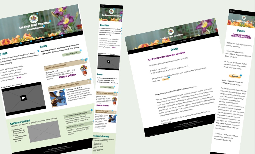
High-fidelity prototypes for mobile and desktop created in Axure and Photoshop
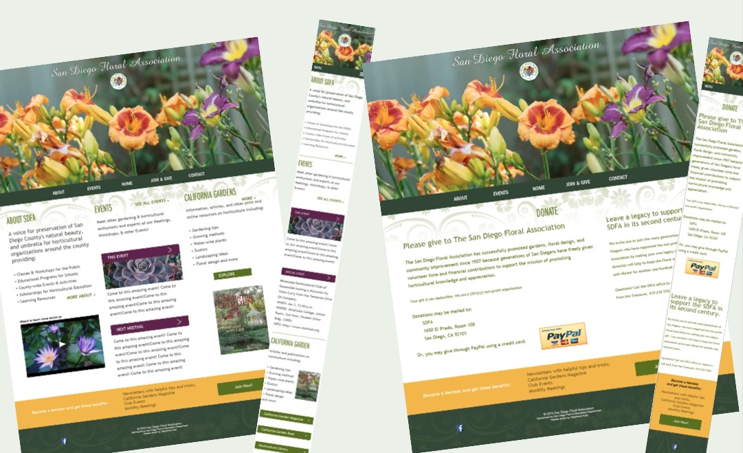
Website Mobile, Desktop
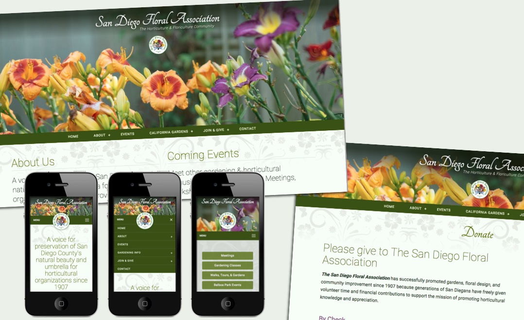
Final website and mobile views
All design by Greg Klamt, except Personas and Standardization Grid with assistance by Yara Bertran.