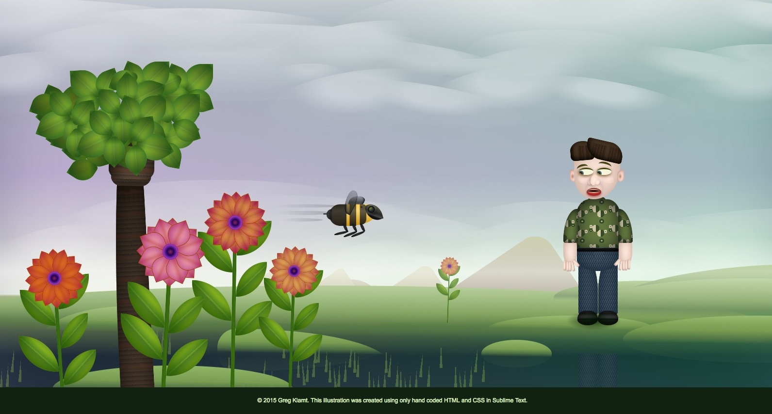
Every element in this illustration was hand-coded with HTML & CSS!
The logical way to create an image like this would be using Adobe Illustrator and, perhaps, Photoshop. However, I often choose illogical paths for the creativity spawned by pushing tools to their limits. I do this mostly for fun, partly for the sake of learning, but also for joy of unexpected results.
I wanted to see what I could create that resembled my illustrations, but purely with code. This ended up combining my passions for illustration, animation, and web development.
It was inefficient, and a lot of work. It was not as detailed as I might have liked, yet it was more elaborate and wonderful than I had imagined when I began. By building it this way, I was able to build in animation and interactions and was highly rewarding in terms of learning and fun surprises.
In this case, I had been experimenting with the CSS border-radius property to create rounded corners on rectangles, and alter the shape of the box when hovering over it—something I might typically do for a button. That—with some creative linear-gradient fills—resulted in a decent looking leaf. That inspired the flower petals, the bee, and onward.
As more pieces came together, I got more creative with the code, thinking of layering, blending and texturing the way I do in Photoshop. As elements came together, I started with hover animations to make them do things, and then began to use a mix of transitions and animations. Note: Because of using the newer features of CSS3, the images, and especially animations only work properly in newer browsers. They are complex and slow, and I will continue to optimize them, and add other changes as time permits.
CLICK HERE TO SEE THE LIVE PAGE
Earlier iteration:

