Web Animation and Code Artistry
Click images to view the live pages.
Every tool has intrinsic advantages and limitations, but it is the limitations that often inspire the most creativity.
Sometimes I choose to make art with the “wrong” tools in order to push myself and improve mastery of the tools and my creative processes, while enjoying myself. This practice informs my work with new approaches and unexpected outcomes, and helps build an ability to balance Form, Feel, and Function.
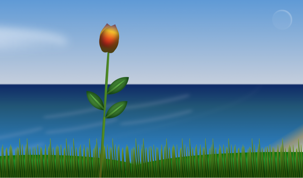
Leafygreen
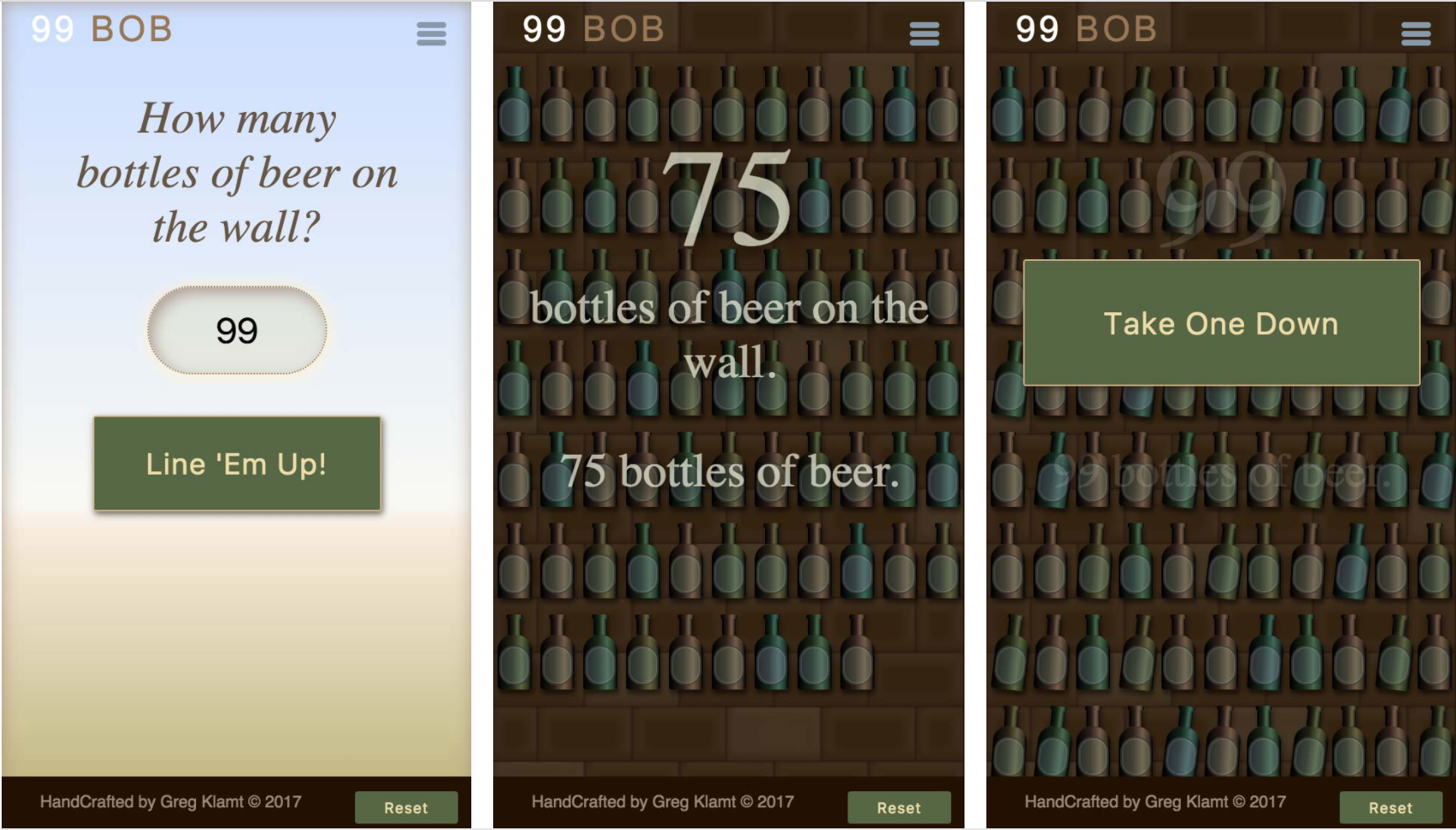
99-BOB.com
This is an app I created as an exercise to improve my JavaScript, and have some fun with CSS animations and interactions. It came out of wondering if I could make a piece of interactive art out of one of the stupidest songs ever written, and improve my JS skills in the process.
All the elements and animations are styled with CSS, including the bottles, bricks on the wall, and other backgrounds. The size of the entire app is less than 100k. (Really small.)
This was my first single page app from scratch using vanilla JS, and I learned a lot and had a lot of fun.
Note on bugs: If it was a serious project, I would have architected it more throughly for game architecture, performance, smoother UX, accessibility, etc.—but that was not the exercise I wanted to do. The CSS illustrations kept the file size small, and look good and resize well, but they are complex, slow loading and put too much weight on the processors. The countdown function does not count properly with a quantity other than 99—though I have an earlier version that works, which I need to merge. It needs fixes for browser compatibility as well.
More CSS Art
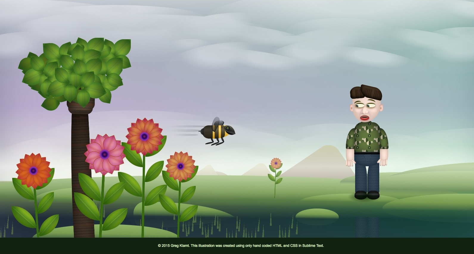
Despite having been focused in web design for years, until recently, I did not think of the code used to create websites as an artistic medium, but rather, more of a vehicle to display content (words, pictures, video) that had been created outside of the coding environment.
In the pieces shown on this page, every element was drawn, positioned, and animated using code, without any external images or other elements, and without any starting plan or sketches. In a similar way to how I would create something in Photoshop or Illustrator, I built one element at a time, and assembled them using CSS layer ordering and opacity, eventually adding interactions and animation to bring them to life.
These pieces all began while playing with code to test styles, transforms, transitions, animations, and other functions to see how far I could go. Departing from my familiar workflows, yet still using my layering, color, form as I might in a graphics app, I was inspired to work and think in new frameworks, and ended up combining my passions for art, animation, and web design while learning a lot about what works and does not work so well.
There is something wonderful in overcoming the challenges and confines and pushing me into new explorations.
